Formula E has revealed its new logo and series branding ahead of the ninth season of the all-electric series.
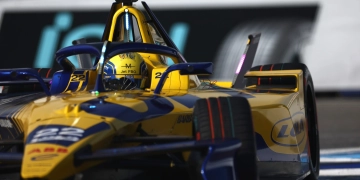
The upcoming campaign will see the debut of the highly anticipated Gen3 car, with all teams hitting the track for the first time next month for pre-season testing.
The opening round of the 2022/23 season will get underway on January 14 from Mexico City.
Formula E has launched a new look for the start of its fresh era, stating that the identity is “inspired by the instant torque of electric acceleration”.
Up to now, the series has used the same branding that it launched almost a decade ago.
“At the heart of the new system is the Torque Loop that represents the excitement and energy at the core of the brand and the sport,” a statement from the series reads.
“This self-sustaining loop is the source of the new logo, typeface and the brand’s new animation principles.”
It added that “the rebrand will be rolled out over the coming days, weeks and months starting with Formula E’s digital estate”.
In addition, new web and app functionality will be launched in 2023 to enhance fan experience.
The ninth season of Formula E will see a number of on-track change, with McLaren and Maserati joining the grid for the first time.
There will also be three new cities hosting the all-electric single-seater series, with those being Hyderabad, India (Round 4, 11 February), Cape Town, South Africa (Round 5, 25 February) and Sao Paulo, Brazil (Round 6, 25 March).
Rookie drivers will also take part in FP1 sessions during the year, while there will also be a 30-second 4kWh ‘Attack Charge’ boost at certain races.
Racing laps will also return, rather than timed race events.


What
the
hell
???????
Why would they do this?????
Looks like a logo for a tampon company. You have to wonder if sometimes design firms aren’t just playing a joke on the client.
The previous branding had so much personality! Why would they cha get it?? Looks so generics
Logo looks like Canva 💀💀💀💀💀💀