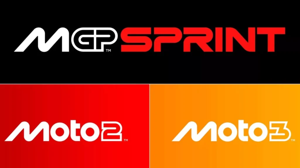
MotoGP has unveiled its new logo as the championship updates its brand identity following the 2024 season conclusion in Barcelona.
The change in logo was revealed at the post-season gala hosted at the National Art Museum of Catalonia, with a voiceover from Game of Thrones actress Emilia Clarke and matching video setting the scene for the entry into a new era.
The new logo was designed by Pentagram and marks the first change in design for MotoGP since the 2007 season, and is the biggest update since the championship’s rebranding back in 2002.
Due to the EU’s trademarking policy, the logo designs were leaked in black and white on Thursday ahead of the season finale, but were officially launched after the weekend’s action had ended.
MotoGP said the new logo was meant to signify different aspects of motorcycle racing, with the M showcasing two bikes at a lean angle, the Os symbolising the tyres and the T representing the rider.
The GP part of the logo is also significant, as it is supposed to summon thoughts of a track layout.
Undisputedly, the biggest change of the new corporate identity is the removal of the chequered flag, which had been a prominent feature of the championship’s logo since the 2002 relaunch.
The typography on the logo has also changed and appears similar to the Women’s Motorcycling World Championship which formed earlier this year.
MotoGP’s design change has already drawn comparisons to its Formula One counterparts, as the typography looks similar, as well as the fanbase having the same initial reaction to the F1 logo change in 2017.
The similarities are likely due to the anticipated takeover of the championship by F1 owners Liberty Media following its acquisition of a majority stake in MotoGP back in April.
Moto2, Moto3 and MotoE also see changes in their championship logos in correspondence with the new MotoGP design, as grand prix racing prepares for an overhaul ahead of the 2025 season.

Carmelo Ezpeleta: ‘MotoGP is more than a sport’
Dorna CEO Carmelo Ezpeleta said that the release of the new logo is an exciting time for MotoGP and that it showcases what the sport is about.
“We’re very excited to reveal our new identity and invite fans around the world to meet the new MotoGP,” said Ezpeleta.
“Working with Pentagram has been an incredible adventure leading to what we hope our fans will agree is an incredible result.
“A brand is more than a logo, and MotoGP is more than a sport. The process has taught us a lot about both and we’re very proud to show the world the results.
“The key question throughout has been, ‘What is MotoGP?’, both now and looking forward to who we want to be.
“We hope this new identity communicates every aspect of that, from the speed to the passion and everything in between. This is MotoGP.”


